Introducing new ways to optimize how you analyze your data
Bitrise is making great new additional changes to how you can use Bitrise Insights. This includes changes to some of our chart titles, the identification of flaky tests, the display of build failure rate and typical duration and more.

In addition to working on Dashboards, Bitrise is making great new additional changes to how you can use Bitrise Insights. This includes changes to some of our chart titles, the identification of flaky tests, the display of build failure rate and typical duration, the display of data points when hovering over a chart, the display of lengthy workflow names, and replacing a workflow column with a module column in your test case table.
Changes to naming conventions
Bitrise changed the way the titles are named on some of our charts. This way you 1) have clarity on the represented data, and 2) can keep track of the data you’re interpreting (in your filters) — even when scrolling past the top tab bar.
Before: The top chart titled “Workflow total” was confusing, as the word “total” was not an accurate reflection of their total workflows. In addition, the second title named “Breakdown per steps” was also unclear, making it difficult for users to navigate and pinpoint what they were looking for.
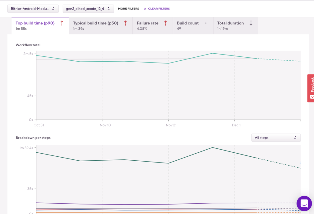
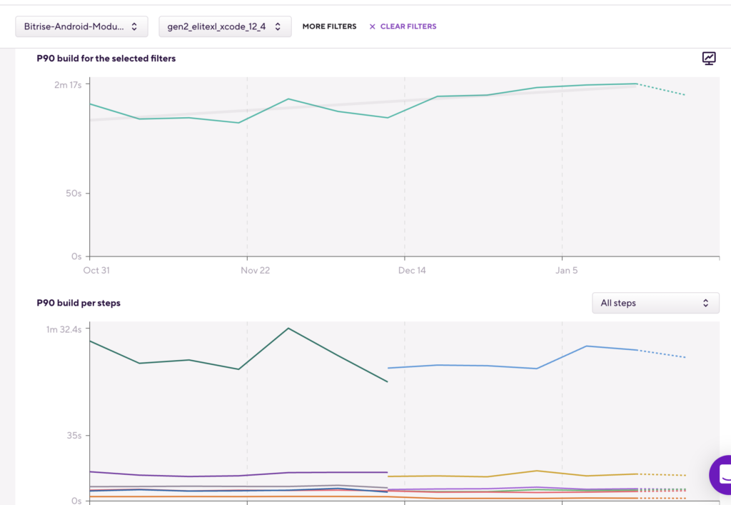
After: By replacing the word “total” with the metrics you are viewing (in this example: the p90 build time), you now have a solid reference of the filtering that was applied and which metric’s data you are viewing — even when scrolling past the top bar. Additionally, the lower breakdown chart mimics this naming convention, with its name also taking on the specific metric you are viewing.
Changes to flaky test detection
Flaky Test detection now shows in manually triggered and scheduled builds when CommitHash=NULL, and the same test is performed multiple times in a single build but with different results.
Before: Flaky Test detection only indicated flaky tests for builds that were started with a commit hash*. When the same test was performed multiple times in a build, where the build didn’t start with a commit hash parameter, flaky tests didn’t show.
This was true for manually triggered builds and scheduled builds. In this example, for manually triggered builds, you typically don’t specify a CommitHash to build — you specify a branch. And for scheduled builds, the same is true for things like daily E2E testing on the latest state of the main branch. Meaning, flaky tests didn’t show.
*Usually when a code change is pushed or a pull request is opened, all builds started automatically and the Flaky Test report/tab already showed the flaky tests of these builds.
After: Flaky Test detection now also detects when CommitHash=NULL, as well as when the same test is performed multiple times in a single build but with different results.
Changes to how, and where the failure rate is displayed
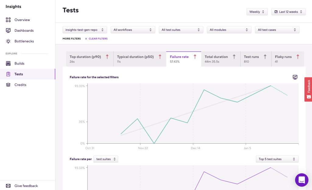
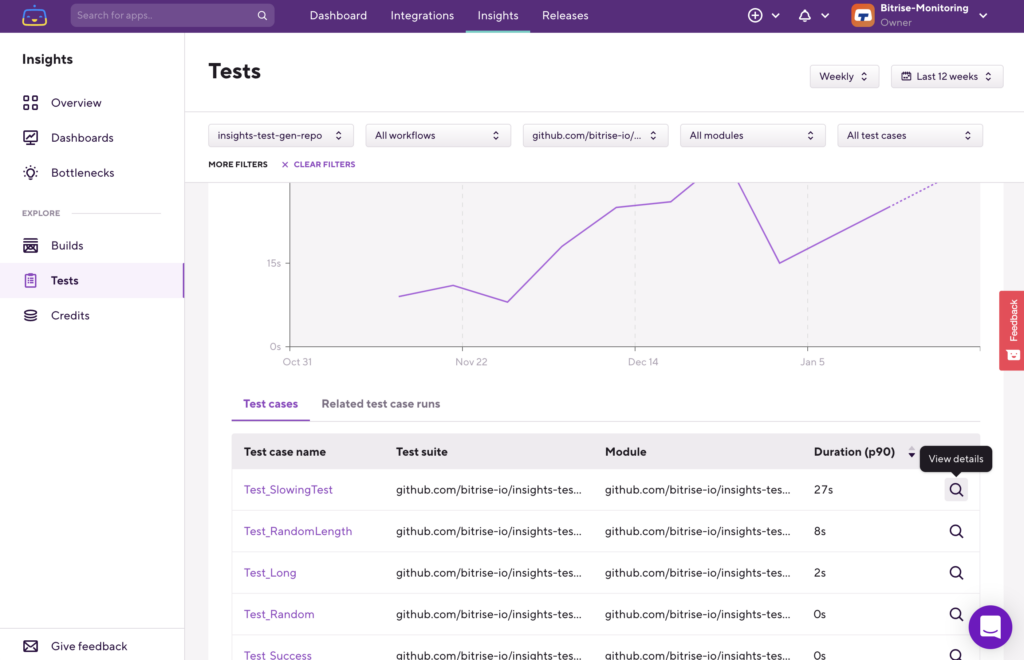
When going into the Explore > Tests pages, you will now see the failure rate displaying the Test Suite run failure rate, instead of the Test Case failure rate — before a test case filter is applied.
Before: If you went to the Explore > Tests page and selected the “Failure rate” tab, it showed you the failure rate on a test case level. This meant that, if you performed (for example) 1000 tests (test cases) in a build, and only one of those tests failed, the failure rate here was 1/1000 or 0.1%.
Mathematically this made sense, but the 0.1% is highly unlikely when looking for the test failure rate of one specific test case. Before these changes, the way you drilled down into your failure rate data and interpreted that failure rate percentage left room for human error and data misinterpretation.
After: Bitrise updated the logic of how you drill down into flaky tests in the UI. Now, when going to the Tests > Failure rate page, it will show you the test suite level failure rate, meaning you can quickly identify whether you have a negative test failure rate trend. Together with the breakdown chart, you can also see which test suite the trend is related to. Meaning, Bitrise minimized how data could be misinterpreted by portraying a more pinpointed, easier-to-understand data reading.
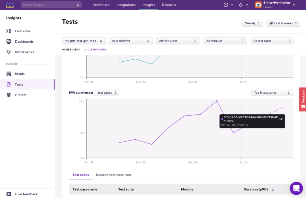
With this change, you can now also filter into that test suite and see which test cases failed most frequently. Once you select a specific test case in the test case table under the charts or set the test case as a filter, the failure rate will show the test case’s failure rate.
Meaning, you can follow through failure rate change trends from the app level, through the test suite level down to the test case level where you can further inspect exactly which builds in that test case failed.
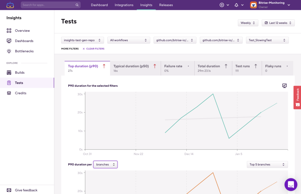
Changes to how a test’s typical duration is displayed
When going into the Explore > Tests pages, you will now see a test’s typical duration for the selected filters displaying the Test Suite run failure rate, instead of the Test Case failure rate—before a test case filter is applied.
Before: If you went to the Explore > Tests page and selected any of the duration tabs, it displayed the duration on a test case level. This made pinpointing slowing test trends from the app level, down to a test case level, difficult.
After: When now going into the Explore > Tests pages and selecting either the Top duration (p90) or the Typical duration (p50) tabs, it will show the p90 or p50 of the test suite, instead of the p90 or p50 duration of the test cases, before applying a specific test case filter. When applying a test case filter, the graphs (and data) will reflect the p90 or p50 duration for that specific test case.
With these improvements, you can now determine if a given test suite is taking increasingly longer to finish.
Here’s how:
Step 1: Go to Explore > Tests and select the duration tab you are most interested in.
Step 2: Filter down into that test suit, and then identify the slowest test cases based on duration.
Step 3: Filter down into that test case for further inspection, and then to identify the issue.
Changes to chart line hovers
Bitrise improved the display of information when hovering over a chart, especially when it has several graph lines.
Before: Previously, when placing the mouse cursor over the target data line or data point, the tooltip — with its relevant data — only displayed when the cursor was nearly 100% close to the exact target. Furthermore, graph lines were only highlighted with the same near-precision cursor movement, unnecessarily making it hard for you to have the right data displayed. In addition, the data that was displayed did — at times — hide important trend lines or data points you were busy inspecting, or when wanting to take a screenshot.
After: With the new chart line hovering mechanism, the nearest data point is automatically selected, and the data tooltip is shown relative to where the mouse cursor is positioned. By not relying on near-100% precision, it is easier to position the tooltip while displaying any data points that you’re inspecting or would like to capture in a screenshot. In addition, as soon as you move the mouse onto the chart, all data points are displayed — making it easy to identify data anomalies.
Changes to the Bottlenecks page
Before: Lengthy Workflows names overlapped.
After: Long Workflows names will be truncated, with the full name displayed when hovering over it.
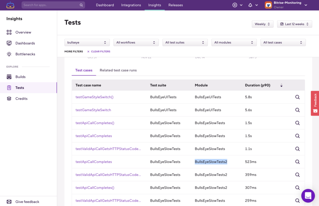
Changes to the test case table: Modules replaced workflows
Last but not least, another Tests related improvement. Bitrise replaced the previous Workflow column in the Test cases table with a Module column. This means that, when you select a Test case in a table using the 🔍 button on the right, both the test suite and module filters of the selected test case will be applied.
This makes a lot of sense when you have tests (test cases) with the same name but in different modules or classes — meaning, those will now be listed separately.
We hope these changes to Bitrise Insights will help you pinpoint your issues faster, and optimize the way you analyze your data.
Happy data digging!